Timing CPU Code

Best practices for timing cpu execution seems to change with the seasons. One technique I always come back to, especially when dealing with short sections of code, is to use the CPU’s time stamp counter (TSC). Now there are a lot of caveats here, like we need to be on x86/x64 and we need to make sure our cpu supports “constant_tsc” (and that it’s synchronized among cores). But let’s leave all that discussion for another day and get straight to the technique –

For consistent TSC results with minimal overhead, Intel recommends¹

1. Issue a serializing instruction (CPUID)
2. Read the time stamp counter, store it (RDTSC)
3. Execute any code we are interested in timing (YOUR CODE HERE)
4. Read the time stamp counter again with a serializing read, store it (RDTSCP)
5. Issue a serializing instruction (CPUID)

And here’s the code to do so –

#include <stdint.h>

inline __attribute__((always_inline)) uint64_t start_clock()
{

        uint64_t hi, lo;

        asm volatile (
                "cpuid\n\t"
                "rdtsc\n\t"
                "mov %%rax, %0\n\t"
                "mov %%rdx, %1\n\t"
                : "=r"(lo),"=r"(hi)
                ::"%rax", "%rbx", "%rcx", "%rdx"
        );
        return hi << 32 | lo ;
}

inline __attribute__((always_inline)) uint64_t end_clock()
{
        uint64_t hi, lo;

        asm volatile (
                "rdtscp\n\t"
                "mov %%rax, %0\n\t"
                "mov %%rdx, %1\n\t"
                "cpuid\n\t"
                : "=r"(lo),"=r"(hi)
                ::"%rax", "%rbx", "%rcx", "%rdx"
        );
        return hi << 32 | lo ;
}

Stick this in a .h file, include it, and sandwich your code between these two function calls. Subtract the start time from the end time (elapsed = end – start) and we’ve got a pretty good estimate of the execution time in clock cycles. The overhead of the timing code itself is something like 35 cycles on my machine. Test it in your own environment.

It compiles on gcc and clang. I haven’t tried it with visual studio, but it almost certainly does not work there (port it!).


¹Gabriele Paoloni described this in his whitepaper.

Artists vs Programmers

In project postmortems I often hear “communication” as one of the major problems plaguing game development. For years I took this at face value and just thought, “sure, so we should talk more!”. At the same time we continually complain about meetings that bog down our productivity. Is communication really a quantity issue? Maybe we should be investing in quality of communication? And taken further, perhaps, there are situations where poor communication is just a symptom of another larger roadblock?

That roadblock, my friends, is developers with divergent priorities.

In game development, I often see (graphics/systems) programmers view themselves as somehow fundamentally different than artists. Either they believe they exist to service requests from artists or alternatively they see themselves as the driving force behind development, and expect artists to fluidly adapt to their systems. Sometimes both of these flawed paradigms exist within the same project! The issue here is that the two groups view themselves as different teams and because of that their goals are split.

Years ago I worked at a company where programmers and artists sat on separate floors. I know of another company where programmers and artists were in different offices entirely, in different cities. Splitting an organization like this is a recipe for communication breakdown.

Programmers and artists are not inherently different! They have different skill sets, but when they’re working together properly, they’re working on the same thing. In fact, the most valuable developers are the ones that can tiptoe across disciplines. A graphics programmer that has no understanding of content creation is extremely ineffective, just as an artist that has no understanding of their tools and rendering techniques is equally ineffective. How can an artist request a feature if they don’t know it exists? How can a programmer implement a rendering technique if they don’t understand what it achieves?

Treating developers as only “artists” or only “programmers” is a misinterpretation of reality. Domain knowledge differences between systems are often much greater than the distinction between art and code for any one individual system. For example, consider the differences between animation, lighting/materials, and user interface. UI programmers are more similar to UI artists than they are to animation or materials programmers. Also, at the cutting edge of graphics technology (which we should be striving for!), the responsibilities of artists and programmers blur dramatically.

The absolute best work is done when everyone in the group has similar priorities. Communication is a crutch needed when those priorities don’t line up. We should not be organizing our projects based on programmers and artists, but around individual game (or tool) systems. Artists shouldn’t need to request a feature, because the team responsible should already want it.

Now I can’t just pick on artists and graphics programmers. There are all sorts of other development stakeholders than can introduce diverging priorities. Sound, game design, multiplayer – to name a few. Any time a task or request is met with resistance, our first thought should be “whose side am I on?”. We’d better have a good answer.

Make Some Noise (In Photoshop)

First, A Story…

Dithering is a powerful technique that can significantly mitigate the costs of image precision loss. It’s especially important now since HDR support is all but compulsory in games, but depending on constraints there may not be enough bandwidth or memory available to support full precision data. In addition to dithering, I also like to add a little film grain on top, just to blend in the noise. Artists enjoy the “film look”, I enjoy the bandwidth and memory savings, and all is well in the virtual world.

That was, until a particular (well-intentioned of course) artist decided my “programmer art” was not to their aesthetic. They wanted to make their own film grain texture. I received a frenzied message, something along the lines of “Oh my god, help! Where can I get your original film grain!?”.

You see, our friendly artist didn’t realize their “film grain” texture was actually my dither texture, which, when used correctly, happened to evoke the nostalgia of Kodachrome and Agfa. Their new hand made “artistic” film grain had completely destroyed the dithering. But why?!

Mathematical Properties

There are a few mathematical properties we’re looking for when building a noise texture to be used for dithering.

1. High frequency noise, not low frequency noise. We don’t want to notice patterns.

2. Values should average to .5 (or 128).

3. Values exercise the full range, 0 to 1 (or 0-255).

As an aside, it should be noted that the third requirement is actually a little mathematically dubious. We could easily build a noise texture that was just 0s and 1s and averaged to .5 (just due to the distribution) over any small group of pixels (say, a 16 by 16 average) and it would work well for our purposes. It’s a little less obvious what should happen if we throw grayscale values in the mix. If you don’t believe me, consider a group of pixels that’s mostly .5 with a few 0’s and 1’s in the mix. Since during dithering we intend for .5 to mean “don’t modify this output pixel” you can imagine this to be a pretty ineffective noise texture (hint, it doesn’t add noise). So, in reality the last two requirements are tied together in some mathy way that I’m not interested in exploring here.

Make Some Noise

So given all these odd requirements you would think we’d have to use some fancy (hard to use, probably command line) tool to generate halfway decent noise. But, it turns out, we can make something pretty good with our trusty friend, Photoshop¹.

Here are the steps –

1. Filter->Noise->Add Noise, Monochromatic, and crank it up if it’s your first pass.
2. Filter->Other->High Pass, use a small value for the first pass, like .5
3. Go to step 1.

Two passes should be enough. That’s it. As you’re playing around use the color picker with a large sample size to check that the values average to 128 and use the “Point Sample” size to check that you’re getting the full range of monochromatic values. More black and white values will give you a better dither result, but more gray values allow a more aesthetically pleasing texture.

Oh and, bonus, your texture should tile just fine since it’s all high frequency noise. If you’re worried you can check it with Filter->Other->Offset

Alternatively, you could just use the image linked at the top of this post. It’s yours to keep!


¹ who ever said Photoshop was good for nothin’? Certainly not me!

Civilization 6 Released!

Civilization VI

Another game, shipped! For Civ6 I worked primarily on the character rendering technology. There’s all sorts of physically-based shading and post-processing goodness in there. Yes, those are anisotropic materials and yes, that is real hair geometry. I won’t bore you with the details (yet). Here are high quality screenshots of some of my favorite characters in the game-

Philip II

Victoria

Gilgamesh

A huge shout out to the incredible Matt Kean who modeled and textured these.

SIGGRAPH 2013 Photos

A few of the sights around town during last year’s SIGGRAPH. A little late (SIGGRAPH 2014 starts tomorrow), but better late than never! Unfortunately I didn’t get any shots of the sessions. I was too busy talking shop with the all the other attendees!

Photoshop Blending Is Broken

*UPDATE* – Arthur Gould has informed me, as of CS6, Photoshop does support multiple layers and other basic tools in 32 bit mode. Converting your image to 32 bit for editing is currently the recommended workflow.

An Industry Standard


Anyone investigating sRGB color space inconsistencies¹ long enough will eventually reach the ultimate bit of irony. Photoshop (the industry standard image manipulation tool) handles all of its blending math completely wrong. This is actually well known among graphics professionals, but the issue is slightly technical, so the vast majority of Photoshop users don’t understand the implications.
 

The Tests


I have constructed an image that Photoshop fails miserably at downsizing². Instead of producing a smaller version of the image, Photoshop just outputs gray.


lena_resize

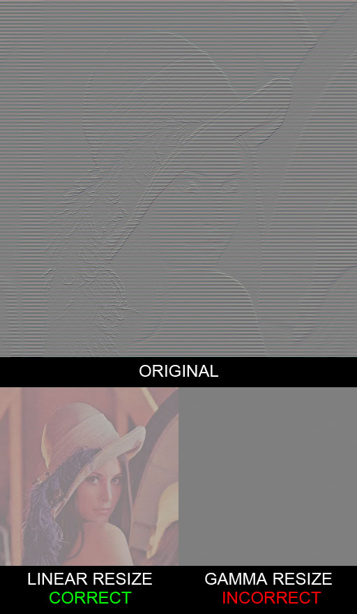
The image on the left is the correct result, the image on the right is Photoshop’s output. If you don’t believe me, try it out yourself. Load this image into Photoshop and downsize it by 50%. See? Now, what exactly is going on?

If we take a half black, half white image and resize it down to a 1×1 pixel, we would expect to get a value halfway between the two, the average.


checker_resize

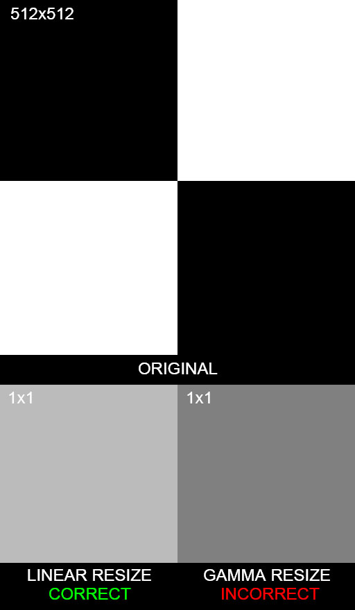
What Photoshop gives us as halfway between (0,0,0) and (255,255,255) is (128,128,128). This answer is wrong. Remember, these numbers are encoded in sRGB space. If we were to properly decode the numbers to linear space, take the average, and re-encode them, we would find the correct result to be (187,187,187). Photoshop gives us an image that is considerably darker than it should be.

Yes, that’s correct folks, Photoshop can’t resize images correctly.

For the painters in the crowd, what would happen if we took a black brush with 50% opacity and used it on a white background? Will we really get 50% (187)? How about if we used the same brush on a 50% background, will we get 25% (136)?


gray_brush_gamma

No, and no, we don’t get the correct values, which means that the brushes themselves are applied non-linearly. Photoshop brushes react very differently to opacity than what we would expect in a gamma correct editor.

Layer blending modes and filter effects also have the same problem. Everything about Photoshop’s blending is broken. We can blame Adobe for overlooking such a serious issue, but hey, most of us never even noticed!
 

A Partial Solution

For a limited set of cases, we can devise a way to workaround “Photoshop Math™”.

As it turns out, the 32 bit color mode is not in sRGB space because that particular format is intended for use with HDR images and sRGB is only valid in the 0-1 range. HDR images need to extend beyond that. If we want to properly resize an image, we can convert our image’s mode to 32 bit, do our resize, then convert back to 8 bit (using “Exposure and Gamma” with Exposure = 0 and Gamma = 1) . Of course, we can’t use this trick for much more than resizing because Photoshop is completely gimped in 32 bit mode.

*UPDATE* – as stated above, CS6 and beyond has a (mostly) functional 32 bit mode. This is the recommended workflow.

Photoshop actually has the ability to do layer blending in linear space. To turn this “feature” on we need to hit the checkbox labeled “Blend RGB Colors Using Gamma 1.00” in the Edit->Color Settings dialog. In my version, I have to hit “More Options” to see the toggle. Why isn’t this the default setting for layer blending?

While you’re there, change your Gray Working Space to “sGray”, as the default “Dot Gain 20%” is designed for print work³ (and who does that anymore?).

If we want to do anything other than resize or blend layers, we’re out of luck. We can’t even do both in the same file since 32 bit mode doesn’t support layers. Jeez!

*UPDATE* – Again, as of CS6, there is support for multiple layers in 32 bit mode.


Where Do We Go From Here?


Is there an alternative to Photoshop? I’m not so sure. I’ve tried a few other image editors out there and they’ve all had similar problems. Will Adobe fix this? I doubt it. The issue has been known for so long, I’m starting to think they can’t fix it for one reason or another.

If someone is looking to eat Adobe’s lunch, here’s your chance. Give us an image editor with correct linear blending. And while you’re at it, throw in a functional 32 bit mode.


¹ For a better understanding of sRGB and linear color space conversion, I refer you to John Hable’s presentation.
² Inspired by Eric Brasseur’s technique. I’ve uploaded my source code to produce the image here.
³ http://retrofist.com/sgray/

Ansel Adams Zone Charts Are Wrong

The Zone System


Most of the charts on the internet depicting the Ansel Adams Zone System are completely wrong. They were produced in the wrong color space.

The Zone System is a perceptual method of reproducing real-world tones in a target image. It was conceived for use in black and white photography, but the concepts still hold true for modern digital images. In fact, Reinhard’s influential paper on tonemapping, “Photographic Tone Reproduction For Digital Images”, was an attempt to apply the zone system in the context of digital HDR imaging. Unfortunately, even the zone system chart in Reinhard’s paper is wrong¹. Ouch.

A zone chart has 11 grayscale values, centered around middle gray (what photographers call 18% reflectance, or Zone V) and should contain entries of increasing brightness, doubling with each entry. For whatever reason, Adams used roman numerals, so Zone X refers to the lightest value and Zone 0 is the darkest. To use the zone system, a photographer decides which zone they want their subject (or some other reference point) to fall under. They then spot meter the subject and adjust their exposure based on it’s offset from Zone V. Light meters are calibrated to expose for Zone V. This system allows the photographer to keep bright subjects bright, and dark subjects dark, instead of everything coming out middle gray.
 

The Chart

In lieu of a full lecture on sRGB, realize that the “0-255” RGB numbers you see in your image editor are usually encoded in sRGB. Keying in “128” won’t get you a value halfway between black and white, but actually something much darker. The right way to build the chart is in linear space, then convert it to sRGB².

Here is how most people build the zone system chart –


zone_system_wrong

And here is the correct chart³ –


zone_system

Notice how each zone feels twice as bright as the previous? These correspond directly to photographic “stops”. On my monitor, I only get about 8 stops of usable dynamic range (Zones 1-8).

Also note the choice of Zone V is arbitrary. I chose that particular value by visually matching my monitor to an 18% gray card. Depending on the image, you could probably get away with moving Zone V down a stop. Unfortunately it’s standard practice to use “255” white for UI backgrounds, so most monitors are set too dark to move Zone V down much more than that.

The dynamic range is not nearly as expressive as most charts may lead you to believe. It’s no wonder why digital images tend to have completely blown out highlights. Tone mapping can mitigate this a bit, but if you ask me the solution is HDR displays.


¹ http://www.cs.utah.edu/~reinhard/cdrom/ – To be fair, I didn’t actually try printing the paper out before judging, but certainly viewed on a monitor their chart is wrong.
² For a better understanding of sRGB and linear color space conversion, I refer you to John Hable’s presentation.
³ The values were estimated using gamma 2.2, so not sRGB exactly.

Row Major vs Column Major Matrices

The Problem


“Row major” and “column major” refer to different memory layouts used to store a matrix. HLSL and GLSL use column major by default, while CPU-side code tends to favor row major. We’ll learn how to reconcile these differences shortly.

Math literature generally expresses matrix transformation with the vector on the left side, oriented vertically, and with the matrices themselves containing vertical vectors defining a transformation. On the other hand, graphics literature often has vectors multiplied on the right side with the vectors of a matrix spanning horizontally. We can call these conventions “column vectors” and “row vectors” respectively, and they are not what we’re talking about when referring to a row or column major layout.

    \[\textit{given vectors }\vec{a}\textit{, }\vec{b}\textit{, }\vec{c}\]

    \[\begin{split} \left(  \begin{array}{c} \left[ \begin{array}{ccc} a_x & a_y & a_z \end{array} \right] \\ \left[ \begin{array}{ccc} b_x & b_y & b_z \end{array} \right] \\ \left[ \begin{array}{ccc} c_x & c_y & c_z \end{array} \right] \end{array}  \right)&  \textit{ row vectors}\\ \left(  \begin{array}{ccc} \left[ \begin{array}{c} a_x \\ b_x \\ c_x \end{array} \right] & \left[ \begin{array}{c} a_y \\ b_y \\ c_y \end{array} \right] & \left[ \begin{array}{c} a_z \\ b_z \\ c_z \end{array} \right] \end{array}  \right)&  \textit{ column vectors}\\ \\ \end{split}\]

 
A row major matrix is stored sequentially with the elements of the top row first, then the next row, and so on. A column major matrix is stored with the elements down the leftmost column first, then the next column and so forth. It’s tempting to associate these memory layouts with row and column vectors, but don’t do it. We could actually choose to store the matrix any way we want, like “Spiral major” or “checkerboard major” or something else ridiculous. We just have to make sure we modify our matrix functions to read the correct spot in memory when accessing each element.

    \[\textit{given row vectors}\]

    \[ \left(  \begin{array}{c} \left[ \begin{array}{ccc} \boldsymbol{A_x} & \boldsymbol{A_y} & \boldsymbol{A_z} \end{array} \right] \\ \left[ \begin{array}{ccc} b_x & b_y & b_z \end{array} \right] \\ \left[ \begin{array}{ccc} c_x & c_y & c_z \end{array} \right] \end{array}  \right) \]

    \[\begin{split} \left[\begin{array}{ccccccccc} \boldsymbol{A_x} & \boldsymbol{A_y} & \boldsymbol{A_z} & b_x & b_y & b_z & c_x & c_y & c_z \end{array}\right]& \textit{   row major}\\ \left[\begin{array}{ccccccccc} \boldsymbol{A_x} & b_x & c_x & \boldsymbol{A_y} & b_y & c_y & \boldsymbol{A_z} & b_z & c_z \end{array}\right]& \textit{   column major} \end{split}\]


The Tools


In theory, to convert from one layout to another we need a conversion function, but the memory happens to line up such that we can convert a row major matrix to a column major one (or vice versa) just by transposing it. We can also reinterpret a row major matrix to column major by not touching the memory at all and just pretending we have a column major matrix. The effect of doing so will give us a transposed matrix. Our row vectors are now column vectors. If we previously multiplied on the right, we need to multiply on the left. This is true going the other way as well (reinterpreting column major to row major).

When uploading a matrix to shader constants that need conversion, we have three options.

  1. Run the conversion function before uploading, and use the matrix the same way as we did in CPU code.
  2. Upload the matrix as-is and treat it as reinterpreted. Going from row major to column major or vice versa has the effect of transposing the matrix. If we used row vectors before, use column vectors in our shader code (multiply from the right, instead of the left). This has the advantage of no runtime cost.
  3. Explicitly declare our shaders to use the same memory layout as our CPU code. This is a pretty good option, but there are reasons for needing a certain layout in the shader.

 
These are all the tools necessary to work with mixed row and column major matrices.


A Clarification


There is one bit of confusion that leads people astray, and should be addressed. If you’ve been paying attention to how reinterpretation works, you may notice a row major matrix with row vectors happens to be identical in memory to a column major matrix with column vectors. They are not the same thing. They have different storage formats and different vector orientations, and they need to be treated that way. We are free to reinterpret one to the other, but they are not the same thing.

For more information check out Fabian Giesen’s excellent post. Some of the comments show just how easy it is to confuse the situation when we don’t divorce the concepts of memory layout and vector orientation.